A font viewer that never uploads your fonts
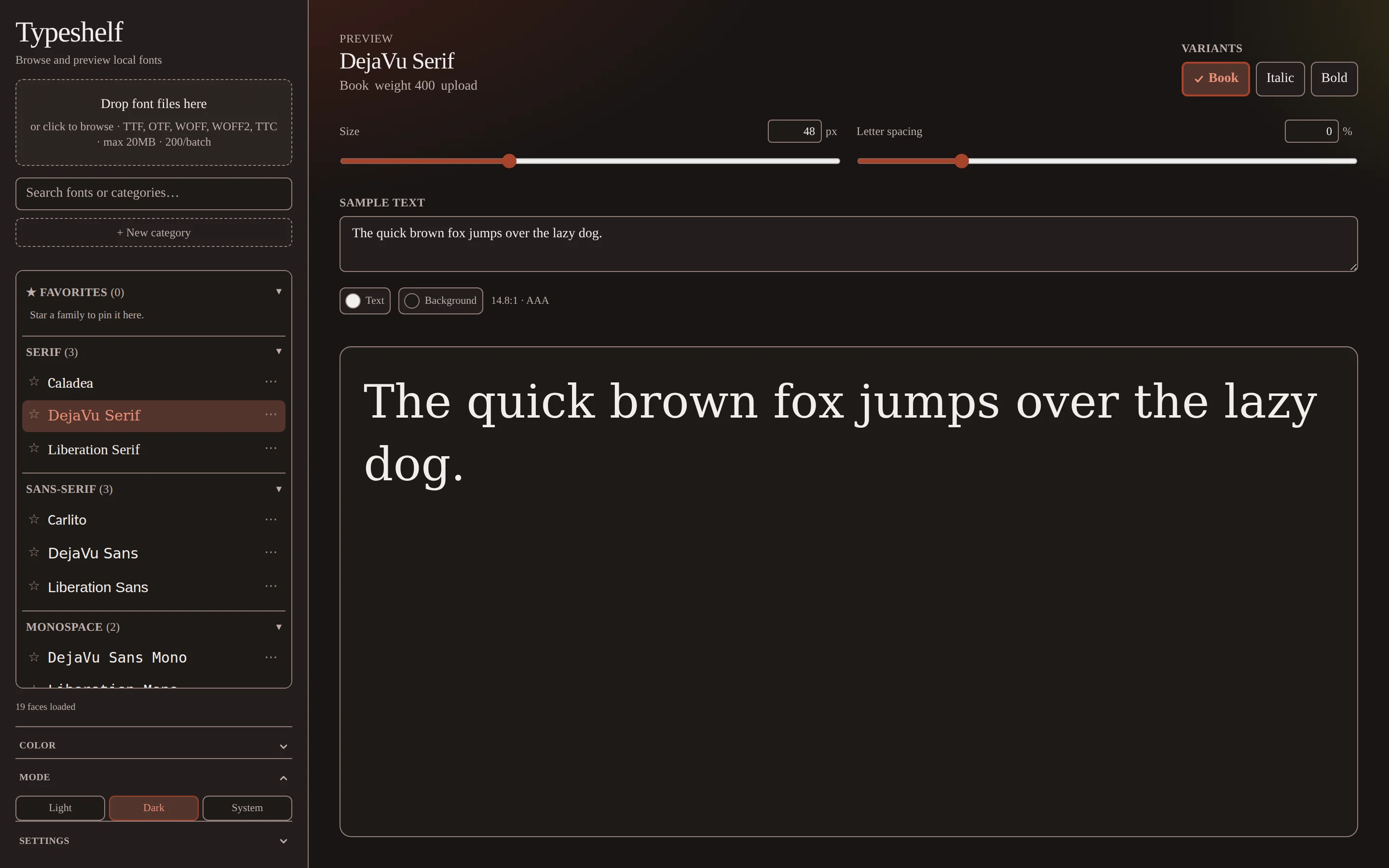
Typeshelf loads a whole directory of type at once, sorts it for you, and hands you the specimen controls: size, spacing, color, background. Every font file gets read, parsed, and rendered in your browser. Nothing is sent anywhere, because there's no server to send it to.
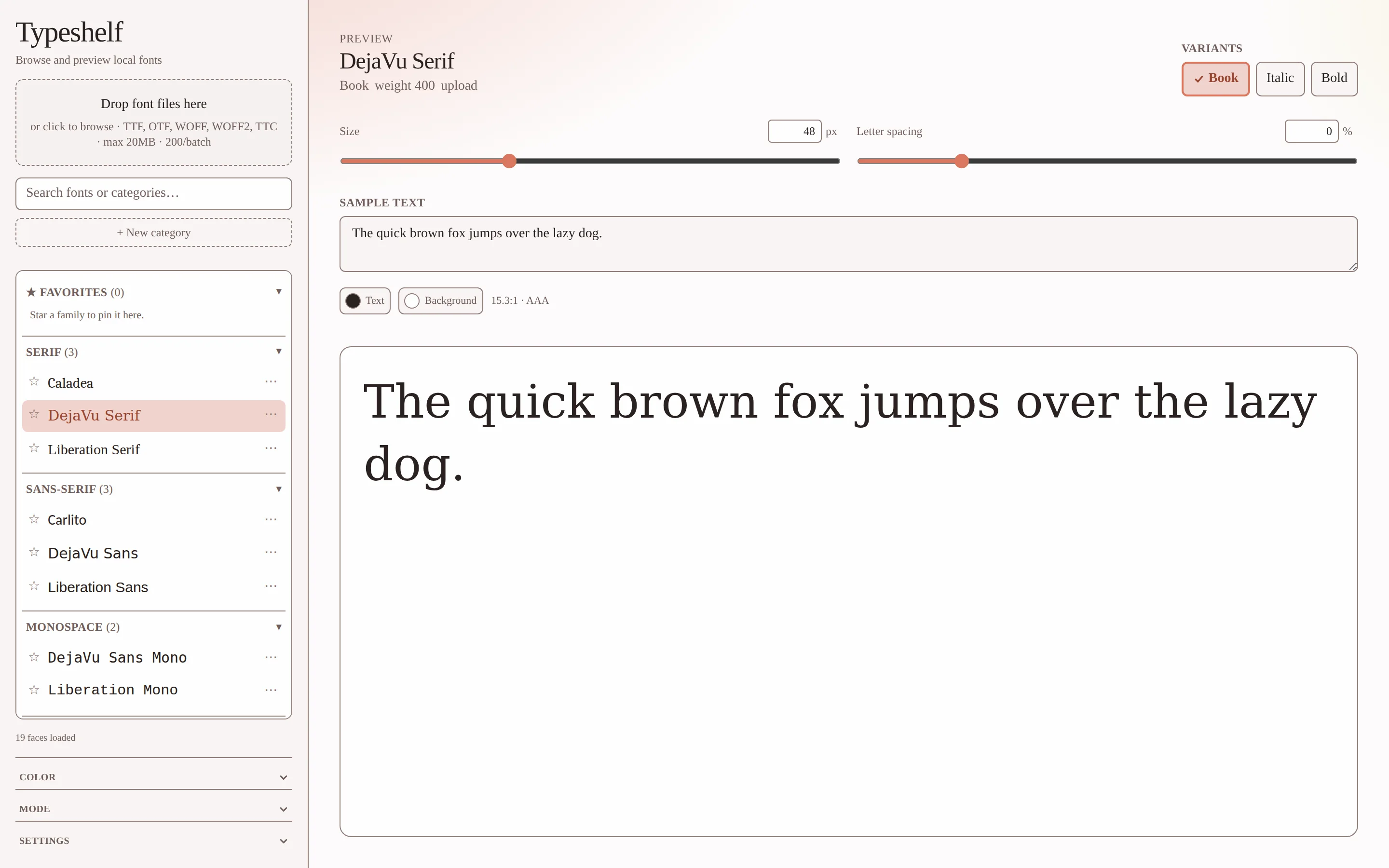
The real thing, running here
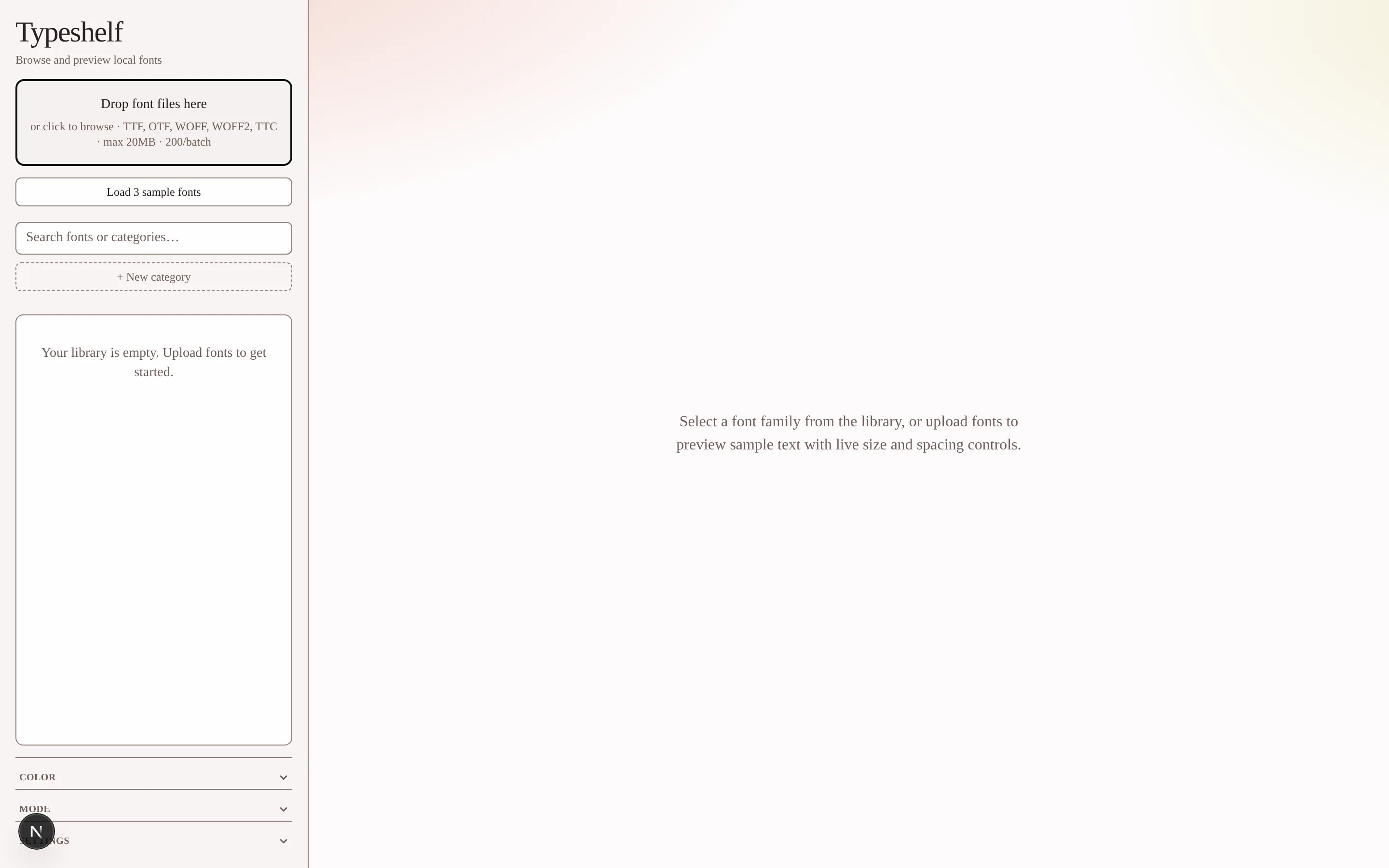
That frame below is the deployed app, and you can use it. Click Load 3 sample fonts, or drag a font off your desktop into it. The file gets read in your browser and goes nowhere.
Drag-and-drop and the bundled samples work inside the frame. "Load my installed fonts" needs a top-level window, so use the tab for that.
Picking type from a folder means opening files one at a time
Every OS font viewer shows you one file, at one size, saying one fixed sentence. If you're choosing between forty faces you open forty windows, and you still can't see them against the background you'll actually use.
The web tools that fix this want you to upload. If you don't hold the redistribution rights to a font, you shouldn't be casually handing it to someone else's server.
So the whole product is one constraint: load the folder, drive the specimen, and never move the bytes.
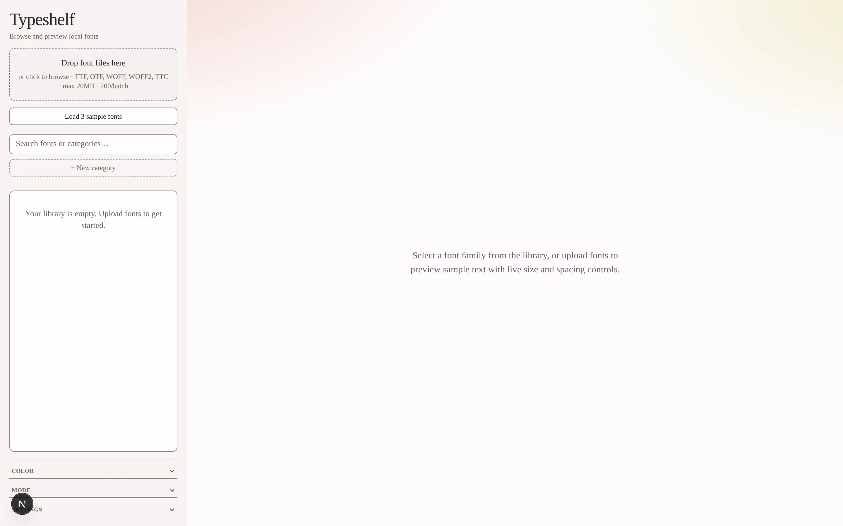
There is no server, and that shapes everything
Font bytes never get persisted and never leave the browser. The only thing stored is how you organized things: favorites, custom categories, theme, specimen settings. All of that lives in localStorage.
That constraint decides how the thing is built. All the parsing has to happen in the browser, so the app ships its own sfnt table reader for TTF and OTF metadata. It decompresses WOFF2 through WebAssembly just to read the same OS/2 and name tables. Preview still hands the original WOFF2 bytes to FontFace, since browsers decode those natively and re-encoding them would be work for nothing.
Storage sits behind a PreferencesStore interface so a backend could be added without touching a single call site. None is implemented. The default build makes no network requests for user data at all.
Sorting a folder you've never seen
Fonts arrive with no reliable category. Some carry good metadata, plenty carry none, and a few lie. So classification runs as a ladder. Each rung only answers when it actually knows, and hands down when it doesn't.
- 01Fixed pitch flag
The
posttable says outright whether every glyph is the same width. If it's set, it's Monospace. Nothing downstream can override that. - 02PANOSE
Family Kind settles Script, Display, and Symbol on its own. For Latin Text, the Serif Style digit splits serif shapes from sans, and that includes flared and rounded, which read as sans and usually get miscategorized.
- 03OS/2 family class
IBM's classification, mapped down to the five buckets. Ornamental and Symbolic classes are protected, so Latin Text PANOSE isn't allowed to overrule them.
- 04Name keywords
Last resort.
mono,code,courier, and the handful of families whose names are more reliable than their tables. - 05Other
When nothing above answers, the font goes to Other. You can go find a font in Other. You'll never think to look for a serif under Script.
It won't fake a weight it doesn't have
Browsers will happily synthesize a bold by smearing the outline, and an italic by shearing it. Both look approximately right and are typographically wrong.
Typeshelf only offers the variants it actually loaded. Drop in DejaVu Serif Regular, Bold, and Italic and you get three chips. Drop in Regular alone and you get one. No grayed-out Bold hinting something is missing, and no fake one pretending something is there.
This is the same call as the low-confidence state in Meridian, in a much smaller box. A tool that fabricates what it doesn't know is a tool you have to double-check.
The thread between both projects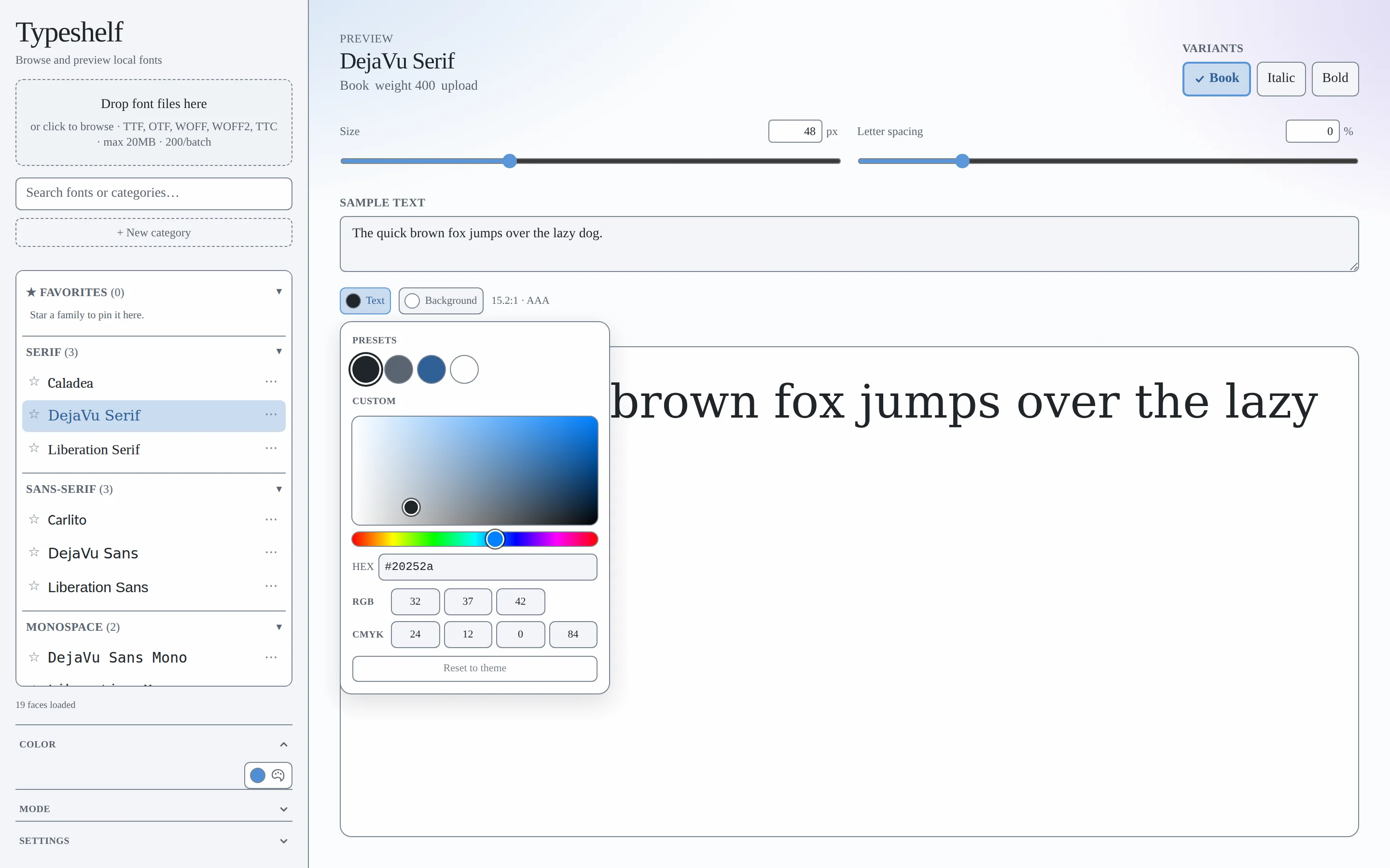
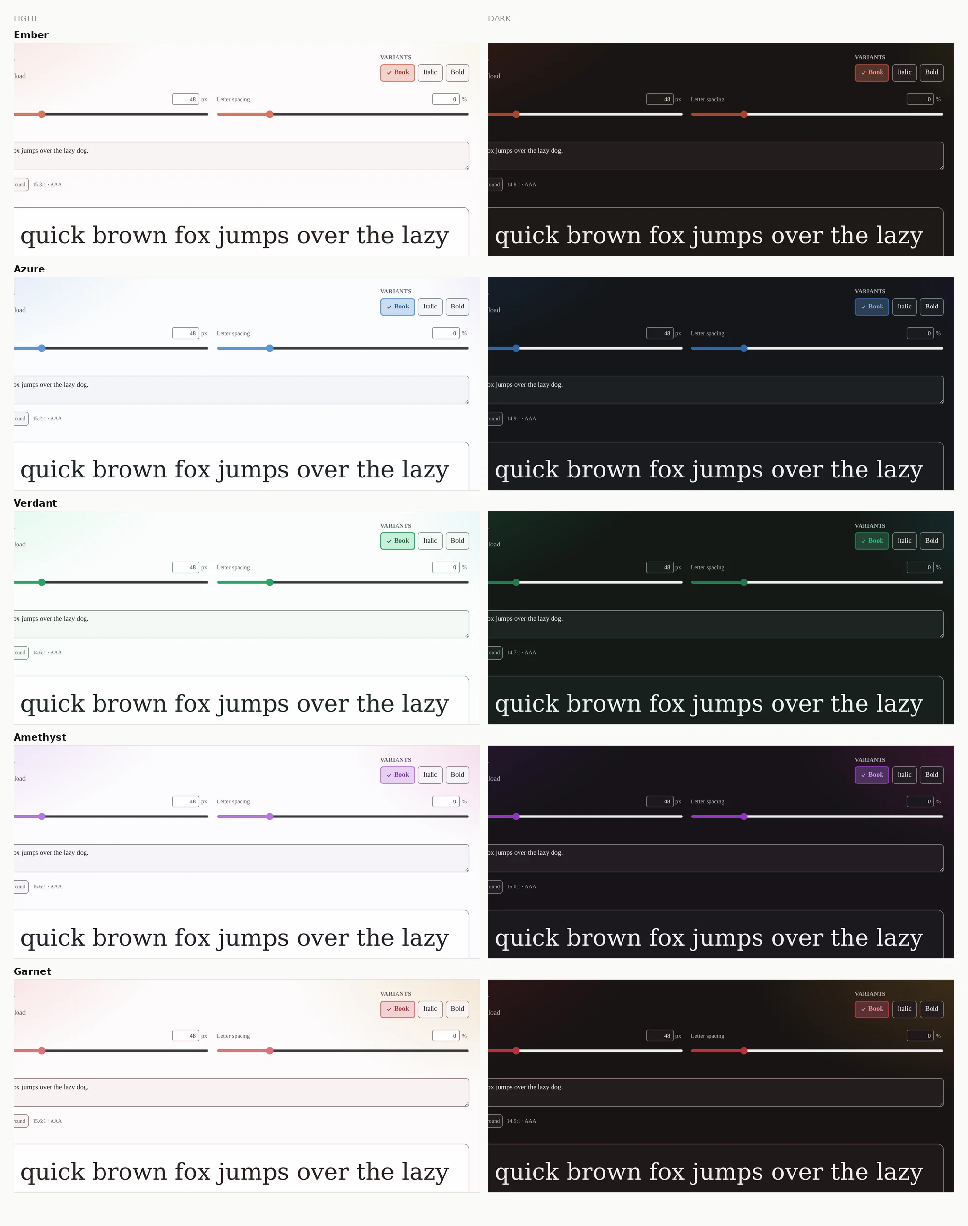
Five schemes, two modes, one token file
A scheme changes the neutrals as well as the accent, so every surface moves when you switch. That means re-checking every color pair in every theme. Ten full palettes.
data-scheme × data-mode → CSS custom propertiesno dark: variants in componentsno Tailwind palette classes anywhereno raw color literals outside two documented exceptions
Every token pair carries its computed contrast ratio as a comment in globals.css. Body text clears 14.6:1 in light and15.2:1 in dark, which is AAA.
CI fails the build on a Tailwind palette class, a raw color literal, or a DOM id built from a template string. Each rule exists because that exact thing already broke once in this repo.
What CI refuses to let throughTwelve findings, and I kept the write-up
I audited it against WCAG 2.1 AA by reviewing every component and recomputing every color pair by hand with the relative-luminance formula. Twelve findings, all resolved. The write-up keeps what was wrong, because that's the useful part.
| # | Finding | SC |
|---|---|---|
| B1 | A 1,000-face library meant up to 1,200 tab stops before a keyboard user reached the controls | 2.4.1 |
| B2 | Ids built from family names collided when a font appeared in two sections, orphaning labels | 1.3.1 |
| B3 | Popovers announced role="dialog" but never moved focus | 4.1.2 |
| M4 | Focus ring was a hue-only border change, 1.03:1 between states | 2.4.7 |
| M5 | Category assignment appeared on hover only, so it didn't exist on touch | 1.4.13 |
| m8 | Selection check sat at 2.38:1 on the gold stop of the color spectrum | 1.4.11 |
Six of twelve shown. B1 got fixed with three skip links. I could have moved the settings above the font list instead, but that puts the page out of meaningful sequence just to save someone a tab.
B3 got recorded as fixed after I checked one component. A second component used the identical pattern and hadn't been touched at all. I only found it later, while I was in that file for something unrelated. Verifying a pattern means finding every instance of it. Grepping the whole tree is part of the check now.
What I got wrongThe second theme had to be free
What you can actually use
One constraint, followed all the way down. "Nothing leaves your browser" is easy to put on a landing page. Here it shows up in how the files are parsed, how the categories are decided, how the tokens resolve, and what CI is allowed to fail you for.
What I'd do next
- Test whether anyone notices that variants are load-only, or whether a missing Bold just reads as broken.
- Virtualize the list. 1,000 faces from the Local Font Access API is a lot of DOM.
- Specimen presets: paragraph, numerals, and a real pangram set instead of one sentence.
Known limitations
- Contrast is verified. Keyboard and screen reader flows are only partly verified.
- Local Font Access is Chrome and Edge only; everywhere else is drag-and-drop.
- Classification is Latin-centric. A CJK or Arabic library will land mostly in Other.